Graphic Designer Hamish Muir
Octavo was a self-published journal, started in 1985.
Simon Johnston, Mark Holt and Hamish Muir started an office called 8vo to make work all about type. Weren’t interested in big ideas, pbogography, illustration, Gill (Bob and Eric), Neville Brodys the face
Boijmans van Beunigen Museum graphic identity.
Octavo Journal ran from January 1986 to July 1990.
- The idea was to only ever publish 8 issues
- Each one woulf be the same format
- All set in the same typeface (unica)
- 300gsm cover witha trace wrap around it
- Octavo format (obviously)
- 16 pages
- Just red, black and greys
- Published every 6 months
They were all about things you could do with printing processes. For the second issue, a spot blue replaces the red plus special blacks, greys and varnish
Issue 3
Printed landscape Columnbia University graphic design lecture series posters: Used spot colours to recreate the original posters
The colour scheme for each issue came out of the content
Issue 4
Wolfgang Weingart: “How can one Make Swiss Typography” Lectures he gave in america that hand’t been published before Weingart used his own 6x6 weird slide projector, they got access to the original slides for illustration again huge production value, special grays blacks varnish etc
Graphic design used yo be more like architecture, you dhad to talk to printers, typesetters all the time Unlike now where its just you and your computer
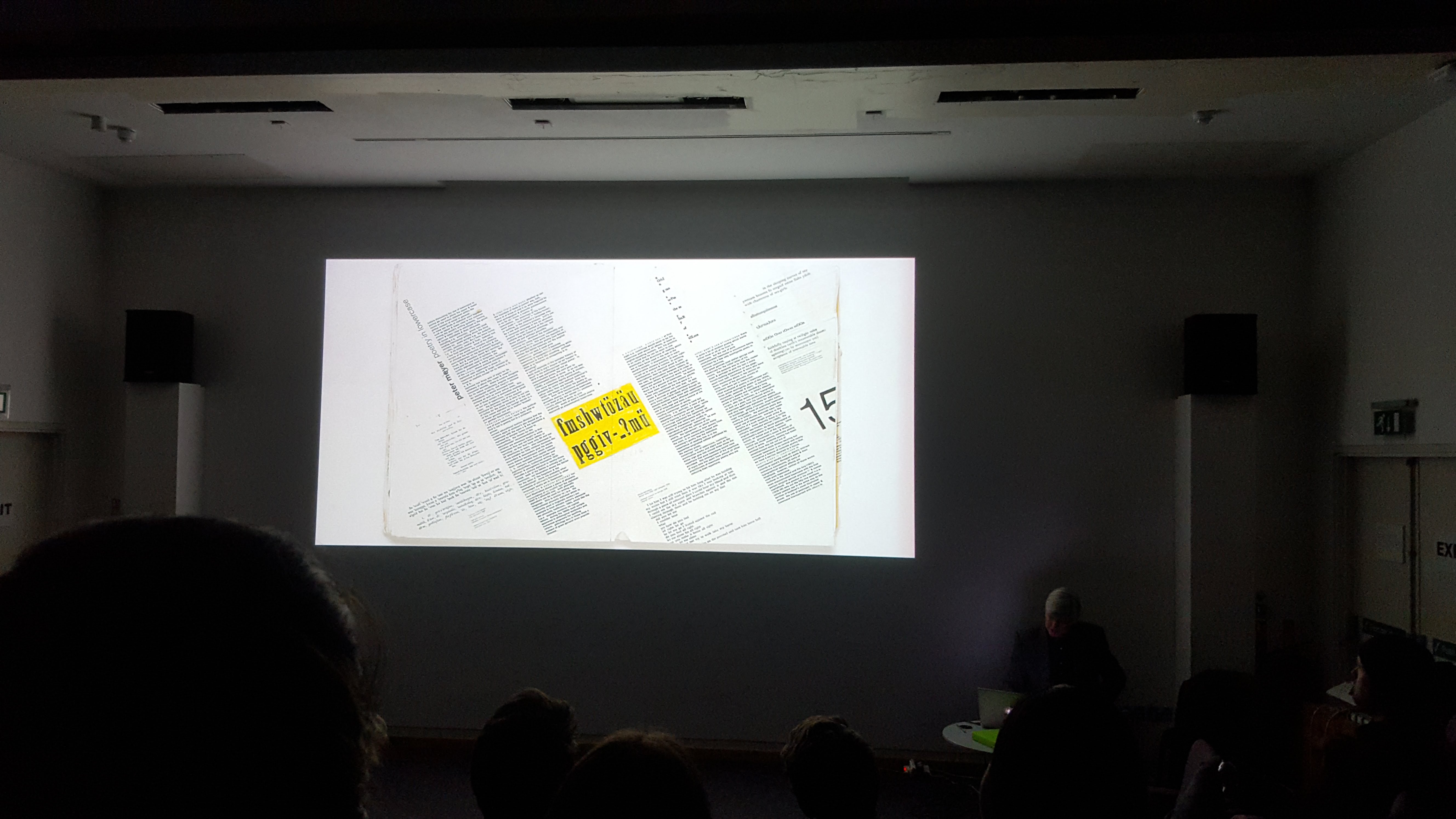
Issue 5 aka the lowercase issue

lowercase use as a way of anti authoritarianism in germany, holland in the 20s
Design comes from 20s modernism This might be the point where the design becam emore important than the content This was the first issue to embrace stuff that could only be done digitally Every spread was 24 columns
Issue 7
Trying to represent iconic early graphic desing work in a new context They had access to original material, dropped them into a more realistic envirnment to show that the people making the stuff weren’t thinking they were the best designer ever making history
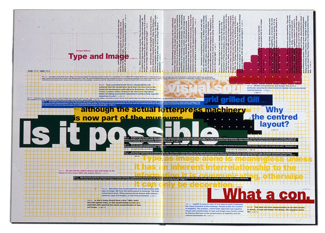
 Above: The most reproduced spread ever.
an articel about why graohihc designers font readm so they made it super hard to read
Print design in the 80s was insane
- All of that early work was made from full scale paste-ups
- All that typography (issue 7) was done by specifying it using math and numbers crop marks and such to a typesetter
- Author’s manuscript came typed from the author
- That would be marked up, sent to the typesetter, who would return the galley print
- Then you’d cut up the galley print and paste it onto a grid
- Send this all back and forth via bikemessenger to the typesetter
Issue 8 (1992)
- They’d run out of money and the CD was the new big thing
- microsoft encarta was going around
- They were interested in what multimedia could mean for design collectors had all these 7 issue waiting for the 8th, and they got this cd 256 colours, built in macromedia director ytpography as interface reading on screen was bad then, so they got voiceover bbc people to read out most of the content 6ue type was a way of navigating the audo content
it was bilt for mac 7.2, 18 months later when mac 9 came out it stopped working
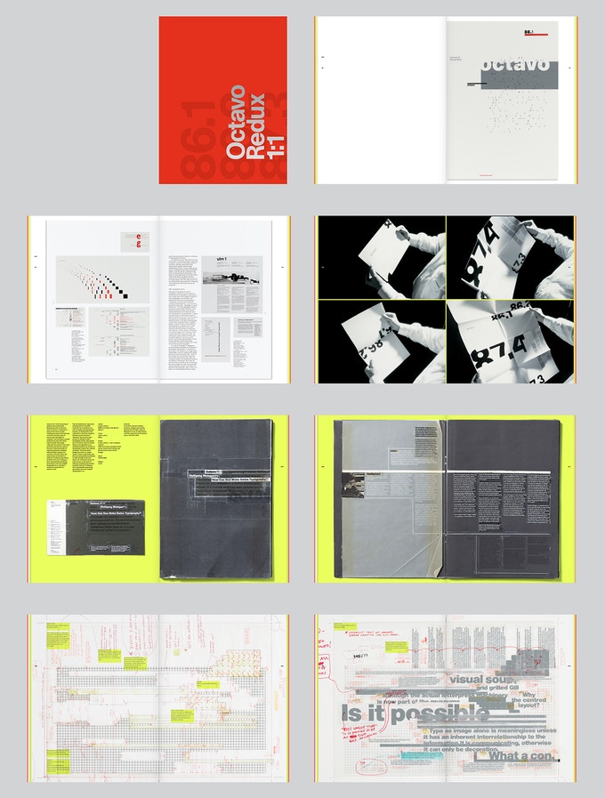
Octavo Redux

Is a book that recods at full scale the original Octavo issues, the type specifications, all the design artifacts etc. It’s published by Unit Editions. Funded via Kickstarter
Again insane printing production value
Stochastic screening instead of halftones so you dont see any printing dots.