Radim Peško
Radim Peško is an independent type designer and graphic designer based in London.

Typography and type design work
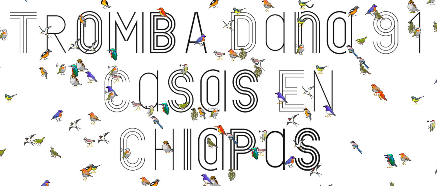
Custom typeface for the redesign of the Museum Boijmans van Beuningen in Rotterdam. Based loosely on the typeface created for the 1968 Mexico Olympics. Modular geomtric typeface, unlike the 68 identity this was developed into a system containing 30 styles (10 weights, each comes in one, two, or three line variants) These are used together to create the visual identity for the museum. More on fontsinuse
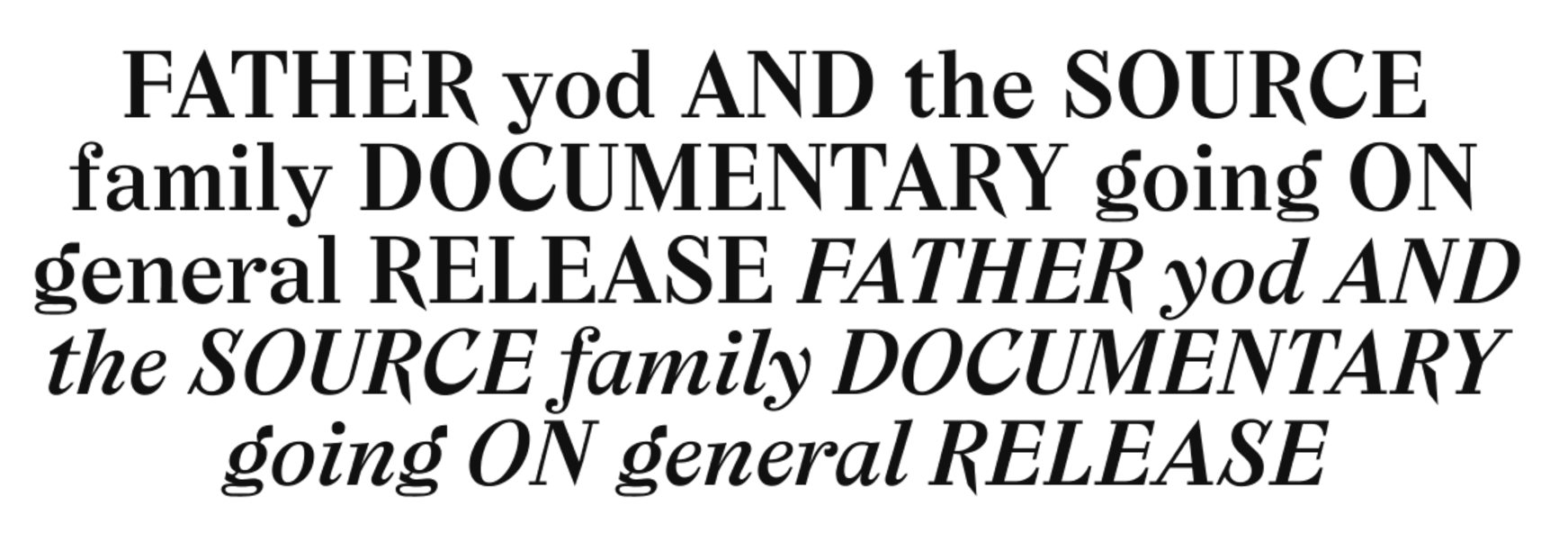
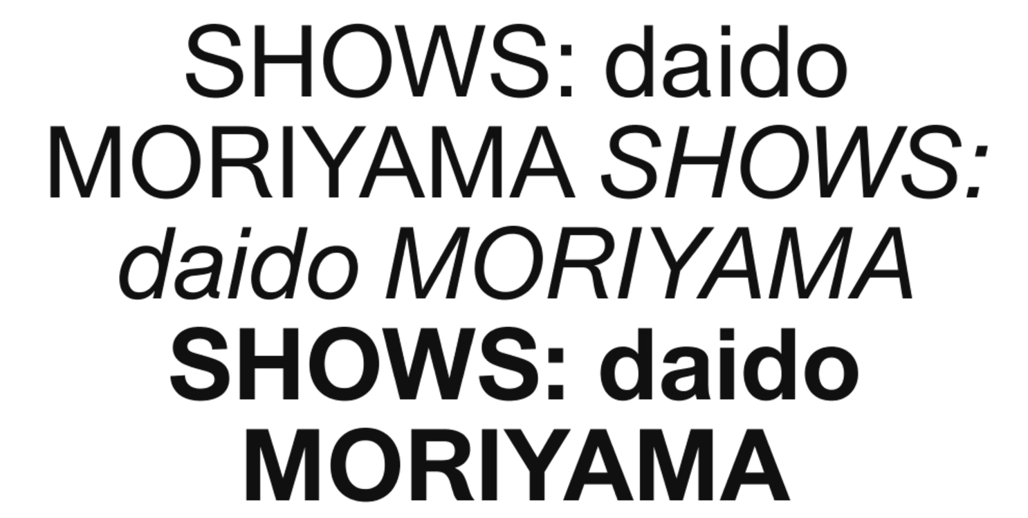
Dot Dot Dot magazine (Graphic design magazine, ran from 2001 to 2010, 20 issues total, here’s the website) approached him to help unify the design of the magazine starting from issue 10. Designing a custom typeface would achieve this while still allowing a large degree of freedom within each individual issue.
Had to be highly readable (the magazine was pretty text heavy), 3 point serifs. From issue 11 each issue had a new iteration of the typeface with adjustements, going from Mitim Alpha (Dot Dot Dot No. 11) to Mitim Lambda (Dot Dot Dot No. 20). This unique structure allowed the design to evolve over time, with different people collaborating on specific issues.
Q: Is there a big difference between making a typeface for a specific design project and making one for commercial release?
Definitely. With a commercially released typeface you want to reach a certain technical standard (in terms of kerning tables, having a complete character set etc.), in a way to make the typeface idiot proof. In a way it becomes more of an end product, so automatically you have a higher standard regarding the quality of your drawing. Also once you put something online it will be there forever, so you want it to be finished.
If you’re makiing something for a specific project or for a specific designer to work with they’re going to be aware that stuff isn’t finished. They know how to use the typeface correctly, how to use it to its strength and not show the weaker parts.
Grew confident enough to use typefaces in other design projects which mirror do you want to lick
started using typefaes in own work
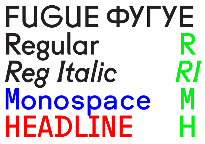 Fugue (2008)
Fugue was designed for ‘Wonder Years’, 2008 publication marking the tenth anniversary of the Werkplaats Typografie in Arnhem.
Realised he was spending loads of time making a typeface that would only be used for a single project, started the foundry. Yet Tschichold Sneezes specimen. Making a typeface takes ages:
- You start with Ag to get an idea for the face
- Then you do the basic latin character set
- Months later you do cyrillic
- Many more months later you finsih the full character set
- Extra months later you do italics
- Years later you have a family
- Eventually you want to give it a name, contextualize it, do marketing for it etc.
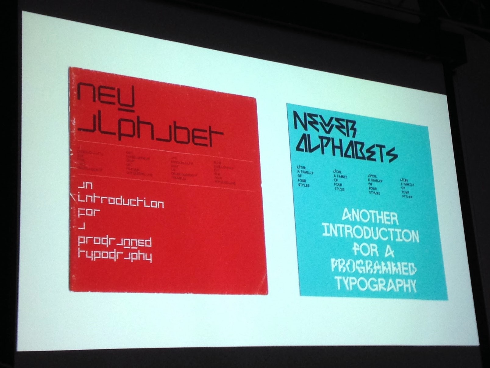
Specimen is based on New Alphabet (1968)
4 different styles, each related to a bit of culture:
- Ulys(ses 31)
- Stan(ley Kubrick)
- Jean (Arp)
- Walt (Disney)
Blend between Helvetica and Arial Union SMA is a more expressive display variant of Union. Developed for the Stedelijk Museum Amsterdam.
Collaborations
katerina szina took people from er home village to do whatever they would be doign at home, eg washing heir cars etc in lonfon tate modern
od b to c designed printed matter with instructions 2nd part of the project was to bring london to the village
designed a typeface called johnston junior based on jonston obv josef sedy
3rd project zastavka# worked with a group of teenagers, made drawigs of the okace where they lived, blown up in leipzig museum 4 der gheist von ust
5 helsinki basker train map with different performners
Graphic design biennale event, graphic design in an exhibition context
27th brno biennial originally v traditional eebt, send in work and prizes are given stepped in in 2014 wanted to change that old fashioned introduced a theme, in this case design education in schools, everything would be about student wrk basicallly asked students and recent graduates to design the exhibition
taking a line for a walk show about assignments in design educationb ‘people who mde the show also publishd a book under the same title to show history of design eductation through assignments
used furniture designed by design teachers max bill school wolfgang weingart tables theres alays moer traditional displays abot czhek graphic design, praque public transport design
2016 czcheck movie posters back in theday when you imported a film you wouldnt adapt the poster but instead a local designer would make aposter with limited recources and with only a plot summary or a single image of the frame
^^^^^^^^^^^^^^^^^ wall with original poster and this guys alternate poter so as you lk past you see both versions
which mirror do you want to lick also part fo 2016 biennale deals with the subject of designing an edition, the idea that once something is printed it becomes real teh only record of a past event is the poster etc
g4 paper was one of the proects (fake paper format) this was usedd for the publication which then made it rel again
qs
where do visual refs come from most of the time its a matter of having an idea fro a single character and working arounf it. mking a typeface is suc a long process you want to make it interstedig enough so you’re gonna stick to it
its not about individual characters or technical detals, they are meant to be used in sequence. zooming in zooming out